UI Design Best Practices

The mobile application market is incredibly crowded, and more than a thousand new applications appear daily. You've probably often wondered what makes some of these applications spectacularly successful and some fail. There is no simple answer to this question. Many different factors determine success and failure.
Our experience as a software development company shows that applications that are doing well on the market have been created by the software development life cycle, thanks to which each stage of mobile app development was adequately analyzed, planned, and prepared.
Another critical factor determining the application's success is undoubtedly the high UX/UI design level. The best applications respond to the needs and expectations of users and provide excellent user interfaces. Both UX and UI are factors thanks to which an application can gain a competitive advantage. Therefore, it is not only essential to know these concepts, but also to understand them thoroughly. It happens that some people use the terms UX and UI interchangeably, which is a mistake. In our article "UI vs. UX - Two Types of Design. How are they different?" we have thoroughly clarified these two issues.
Our many years of experience creating successful projects show that an application can achieve spectacular business success thanks to a great UI. In today's article, we will look at the best practices for the user interface, which is a critical part of any software. But if you want to know more about UI, read our article "Mobile App UI Design - Everything You Need To Know."
What is User Interface (UI)?
There are many definitions of User Interface (UI). Still, in the case of software development, UI is all the elements of an application or website that enable interaction between the user and the system. In this case, we will discuss visual elements, voice, or 3D elements that help the user communicate with the application or web page.
What is User Interface Design?
User interface design is a complex process where UI designers create touchpoints connecting the user and the application in the virtual world. UI is the layer closest to the user, so you need to take care of its functionality in addition to the purely visual side. For this reason, designers try to create interfaces that are easy to use and help users quickly solve a problem or meet a specific need, which will translate into a positive experience with the product. Good user interface design is not only about design elements but also about usability. Users will not appreciate even the most visually beautiful project if it is not functional and intuitive. User-friendly interfaces are a must-have element of any software project.
Top UI Design Best Practice
You have probably wondered more than once what makes a given interface well-rated by users and another not. What makes users interact with the product only sometimes providing a positive experience? Is it a matter of visual hierarchy, page layout, or other UI elements? We have prepared UI design tips based on our many years of experience creating mobile and web applications. Thanks to this, you will know what to pay attention to during user interaction design.

Remember, every choice a UI designer makes should consider users- their needs, what they hope to gain from using the site or app, and the circumstances in which they'll be utilizing it. Too often, people make the mistake of designing for themselves instead the for users. What may seem intuitive and straightforward to you could result in complete confusion for your target group.
User research is crucial to the design process and should be carried out regularly. By understanding user behavior and needs, designers can avoid making unnecessary assumptions and wasting time on features that users don't want or need.
One of the best ways to create a unique design is through intuitive design. UI design does not require a high level of creativity or innovation. It focuses on helping the user's task completion in the most efficient way possible. Using too complicated solutions will make the user stop using the application. You cannot force users to use applications or sites whose user interfaces do not suit users.

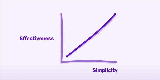
Often, simplicity is underestimated and underutilized in UI design. The best interfaces are uncluttered- with one task or key element per page. Too much information overloads, confuses, and distracts users. Good design doesn't stuff a lot of info into one tiny space; rather, it carefully guides the user through their journey as easy as possible.
A good user interface must be useful. If it does not meet this condition, then you can be sure that the application will fail. A useful application or website takes into account the needs of the user. There are five main criteria for determining whether a project is useful:
- The useful user interface helps the user to perform tasks correctly.
- Minimizes the user's efforts when performing any task.
- It is user-friendly and intuitive.
- It has a smooth learning curve.
- It provides users with error resolution to decrease user frustration and keep them using the product.
If your project meets the above criteria, you can be sure that your product will have a good user interface. Thanks to this, the user will learn a new application smoothly.

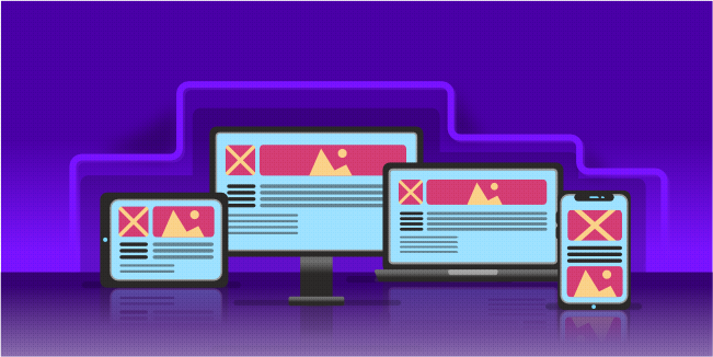
Whether creating a mobile application or a website, you must be prepared for your website to be displayed on a laptop and many mobile devices. It is because the number of mobile devices has been growing for many years, and this trend will not change for a long time. Therefore, when designing the user interface, responsiveness must be considered. Responsive design is one in which the website changes its size depending on the size of the screen and the browser on which it is displayed. Each element of the website adjusts in size to the device on which the website is displayed.
For example, smartphones have big limitations in the form of small screens. Therefore, designers must build a well-organized content structure with clear priorities so that the application is functional for all users of different types of mobile phones. Regardless of the device model, important content and features should be immediately available to the user.
Consistency is one of the most vital factors in usability and ease of learning. When we talk about consistency, we mean several types of it. Visual consistency consists of the uniform presentation of all elements available in the application. The same colors, fonts, and icons should be present throughout the product. The buttons should also look the same. If you use the red "search" button on one page, it must look the same on every other subpage, and it can't be red, green, and blue. Users cannot wonder why the color changes and whether the button in a different color has different actions.
In turn, consistency of behavior means that a given element should work the same way throughout the interface. The behavior of various buttons and menu items should remain the same in the product. Users prefer to avoid such changes and are easily frustrated when it turns out that a given button works differently than on other pages. Such changes further hinder product learning and make the user question the professionalism of the application. Therefore, do not mislead the user and do not surprise him with the change of the function of a given button. It's the kind of surprise that all users hate. The product interface must behave by the expectations of users.

The UI of an application is made up of many design elements, each playing a part in the overall UI patterns. To avoid getting lost in the maze of icons and buttons, create a thorough list of the elements used and ensure that individual components are used appropriately and provide a consistent experience.
Clear navigation areas
The success of any app or website depends on users finding their way around quickly. Navigation allows users to do this by helping them locate specific content and features. Good navigation works together with a clear content structure and should always reflect the category hierarchy; otherwise, users will get lost and give up. On mobile devices, in particular, navigation areas must always be visible.
Visibility of important elements
All critical elements in the application must be visible. It's pretty obvious, but sometimes designers forget about it.
It is worth using the contrast of colors and judiciously choosing its size to highlight an essential element. Larger-sized pieces with brighter colors will attract more attention than smaller pieces with neutral colors. Regular geometric shapes are perceived better than irregular shapes, and any movement, such as animated effects or video, attracts more attention than static elements.
Recognizable icons and symbols
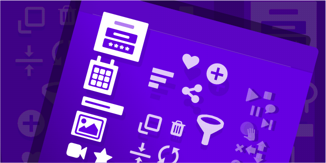
Designers often find iconography one of the more complex areas of visual design. It is because icons are small but need to remain legible and recognizable. Icons can only have a few details, which can lead to confusion for users who may see different things in the same icon. This difficulty is amplified when designers attempt to use abstract categories that real objects cannot represent.
There are two things to keep in mind when it comes to iconography. The first is to use real-world objects as symbols for activities that happen in the digital world. So, for example, the trash can symbol always stands for throwing an item away. The second rule is to include text labels with the icons, especially if they're abstract and might be confusing. You need to decide which option will be best for your project.
Appropriate Typography

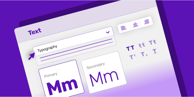
Always use fonts that are easy to read, with balanced spacing between letters. Strong contrast is vital for legibility - black text on a white background works best.
Creating a font scale before you start designing will make it easier to ensure your headings have enough visual weight. Breaking large blocks of text into smaller chunks will also make them easier to read.
The placement and visibility of your calls to action (CTAs) are essential to a high conversion rate. If there are too many CTAs on a website or application, it will compete for the user's attention. It would increase cognitive load and confuse about which action the user should take next. To encourage the user to click on your CTA, you need to make it the most conspicuous element of your software product.
Conclusion
A successful user interface is one that people want to interact with. It is not only aesthetic but also intuitive, simple, and easy to use. However, it is worth remembering that UI design is a big challenge and requires experience and knowledge in various areas (e.g., psychology). Therefore, an experienced software development team with many successful products should handle such a task. If you want to talk about your project, arrange a free consultation with our specialists at a convenient time. We will happily share our knowledge and experience in creating great user interfaces.