Golden Rules of UX design

Creating a digital product requires knowledge, experience, and persistence. Software development life cycle greatly facilitates this process; however, it is up to you whether you treat the individual stages of this process with due care.
It very often happens that people with little experience focus only on design. In contrast, the combination of UX/UI design is the key to success. Even the most beautiful product will be rejected by users if it is useless and does not meet their expectations. So even if you have an excellent app idea, learn the secrets of product design to know what aspects are worth focusing on. The user of your product must always remain the center of attention because it is for them that you create the product, not for yourself.
This text offers 16 golden rules for creating the perfect user experience and a UX Checklist. After reading these rules and completing the checklist, you will know how to:
- Build customer loyalty
- Design a visually attractive, engaging, and intuitive digital product
- Answer end-user problems
- Check whether your existing UX is well designed
5 seconds. This is enough to love or… kill your application
Did you know that the user needs a maximum of 5 seconds to form a preliminary opinion about the product? Psychological research confirms that the human brain operates extremely fast (in thousandths of a second), and the first impression arises in the mind very quickly, in an uncontrolled manner. Fact is, people tend to stick to opinions formed on the first impression. Therefore, you must do everything possible to ensure that your product is positively assessed within the first 5 seconds. This is enough to love or kill your app.
What is UX?
Before you learn the golden rules of creating a good UX, you should understand what UX is. User Experience (UX) is the user's sum of experiences and emotions when interacting with a given system or website.
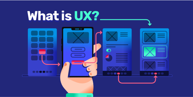
Unfortunately, we see more and more often that this is a factor that is treated neglectfully in the excitement of creating a project. Meanwhile understanding and satisfying the customers’ needs is the absolute minimum of what a good product should do. In order to be great, the product must also be:
- visually attractive
- engaging
- straightforward
- navigating it's functions should be easy
However, UX is about more than usability, simplicity, and aesthetics. Positive user experience is the best method of gaining an advantage, a way to gain the sympathy and loyalty of users and simply a necessity.
1. The user is always the center of attention

The most important golden rule of creating a good UX is straightforward, and yet it causes many problems for designers. Keep in mind that the user must always be the center of attention throughout the digital product development process. You have to accept his perspective, understand his needs and expectations. Therefore, you have to try to get to know your users because you are creating the application for them, not for yourself.
Always try to think about :
- the age of your potential audience,
- their interests,
- trends in their world that you can use to interact with them.
The use of Mickey Mouse may be interesting for 5 -year-olds, but it certainly will not attract a 15-year-old. Remember about your client all the time. It is a product for him, and he will decide whether to trust it or not.
Does it happen that UX fails?
Of course. But only when we forget the human element and move too far from reality and neglect the user's needs.
2. Customer needs

Understanding and recognizing the needs of our users is essential. It is worth conducting user research to get to know them and thoroughly understand their problems and expectations. If you have no idea how to begin, there are many established customer research companies to which you can outsource this task. Using their experience and know-how they will prepare reliable reports answering your questions using modern research tools and methods. However, using the services of such companies is not cheap. Often you will find their proposals way out of budget and be forced to conduct such research on your own.
All in all, research of clients' needs is all about asking questions and listening actively to the answers. There are many different ways of identifying clients' needs, such as:
- pre-meeting questionnaires,
- an interview,
- website form.
But nothing can replace a traditional, direct face-to-face conversation. Whether you entrust the user's research to specialists or decide to do it on your own, you need to talk to your prospective clients. Nothing can replace that.
3. Personalization
Users expect high-quality applications. And to captivate the target audience, startups need innovative strategies to design a tailor-made UX to the needs of these users.
An ideal application must be :
- functional,
- reliable,
- useful.
In addition, it must be one of a kind, my own, and it should resemble a self-designed birthday card. In today's world, everyone likes to stand out, which is why a personalized and contextual interface is the perfect answer to users' expectations.
4. Language matters

For a long time, UX designers have focused solely on the aesthetic side of the product. Meanwhile, our observations show that the language of the application also matters. Use simple language:
- short sentences,
- straightforward vocabulary,
- clear structure,
- aesthetic design.
If long text is essential, make sure that the format is visually readable, interesting, and engaging. And never underestimate the power of a good font. The long or complex text causes many cognitive burdens and poses the danger of losing the user’s interest. It is also crucial to adjust the language to the preferences of our users. The greeting "emoji" may not necessarily appeal to a middle-aged person. ;-)
The task of the UX designer is to increase the ease of use of the product and show its benefits. Achieving this goal will improve product usability and understanding - and it will keep users coming back for more.
5. Details are important

The user must be satisfied! All other UX goals are irrelevant if this condition is not met! The application's personalization and simplicity are critical, but it must have this "something for the application to impress": the sum of small details that together surprise and delight.
It is to create a unique impression that will be an individual experience for each user. You have to remember that these elements cannot be an end in themselves; they have to be "the icing on the cake," something that will sweeten the day for the user. There are many ways to add a "wow" effect to an application, for example:
- simple animations,
- auditory and tactile experiences,
- unique content based on the interests and actions of the user.
Such an individual approach to the client always pays off with loyalty.
6. Universal challenges
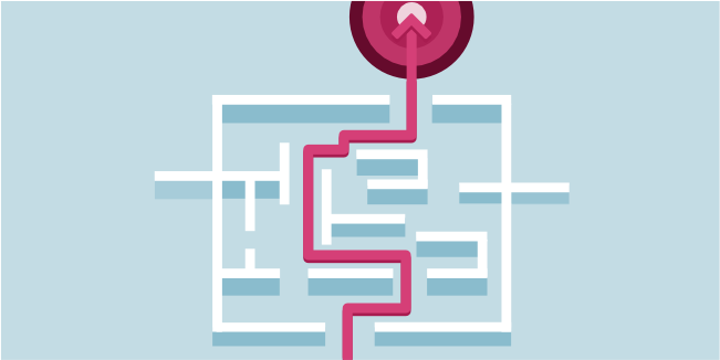
No matter who the product is targeted at and what its nature is, the challenges faced by UX designers in all industries are universal:
- low users loyalty and motivation,
- boredom,
- procrastination.
It seems that such problems constitute an insurmountable barrier. Meanwhile, it turns out that simple steps can significantly increase users’ loyalty and motivation and make the application engaging and inspiring.
Setting goals and appreciation
7. Setting goals and appreciation

The ability to set goals is often a key component of many applications. Of course, there are industries where the application of this solution is not needed, but there are also industries where this factor is a fundamental part of the project. It all depends on the nature of the application and the needs of its users. If you choose to do so, it makes sense to apply the S.M.A.R.T. concept, which helps you set your goals correctly, increasing the chance of achieving them. The goals can't be too easy, but at the same time, they can't be too hard. A goal that is too ambitious undermines faith in achieving it, while a goal that is too easy kills motivation and causes boredom. It is also essential for the user to be able to define his goals himself. Regardless of whether the application is aimed at a child or an adult, it is crucial that even the smallest user achievement was rewarded. Of course, we are now talking only about virtual prizes, which can take the form of virtual cups, badges, fanfare, or even confetti. In short, something that intangibly appreciates the efforts of users. Such appreciation of the user not only affects his well-being but also improves his motivation and commitment.
8. Building a community

Building a community is another element that supports the motivation of users and positively influences their loyalty. Online communities can be defined in different ways. In the basic sense, they are all communities of people - even temporary - gathered around a common goal or discussion on a topic interesting for everyone. Members of such communities support each other in achieving goals, which is extremely important for users; it builds their commitment and motivation.
Of course, creating a community is not obligatory and always depends on the nature of the application. However, it is worth remembering that in the case of e-learning, motivational, or even medical applications - communities are almost an integral part of the application, and it is impossible to imagine a project without this factor. Therefore, each time it is necessary to analyze whether the type and nature of our project require building a community.
9. Limit your choices, be moderate
Despite its small size (only 2% of the total body weight), the human brain consumes as much as 20% of the energy produced by our body. Nevertheless, it cannot process all information flowing to us from the environment despite its energy consumption. When the amount of data we are exposed to exceeds our ability to process it, our efficiency drops: it may take longer for us to process the information; we may unknowingly skip details or even abandon the task altogether. Interestingly, we usually don't realize it!
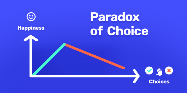
When you ask the user if he wants to have more choices, the answer is always “YES.” However, research shows that people feel less happy when they have to choose from many options. After being presented with several choices, users tend to feel dissatisfied with the decision made and are even more likely to abandon the entire process. This phenomenon is called cognitive load. In most cases, restricting choice provides a more positive user experience and increases user engagement. Therefore, when designing UX, it is very important to exercise moderation. Too many options, a large number of links, graphics unrelated to the page content, or too flowery typography - will slow down the user's actions. And they can make them abandon your product irretrievably.
10. Copying
A good design should be unique. Even slight copying can make it stop being positively distinguished and, as a result, make an uninspiring product, similar to many others. There is an apparent distinction between inspiration and drawing from someone's experience and blind copying. The difference is implementing good practices and constantly asking how they can help me improve application design. Therefore, do not copy, be yourself. Everyone likes unique and original things and is not excited about the same-looking applications.
11. Laptop or mobile phone
Probably every designer dreams of creating an application that will be attractive to both laptop users and mobile phone users in the same form. Apart from technical issues (such as the need to include only the most important functions in the mobile application because all of them would slow down the application), it is worth remembering that the use of these two devices is entirely different. And it's not just about format issues but more about the mental and emotional state of the user. In mobile phones, the application competes with other installed applications and various activities, such as:
- receiving text messages,
- making a phone call,
- boarding the bus with the phone in hand.
The user is involved in several activities simultaneously, which means that the application must even fight for his attention.
Meanwhile, laptop users use them at work, or in the comfort of their own home, or even at school. Then they do not get on the bus and do not perform several activities at the same time. They are in a completely different mental and emotional state than the cell phone user. Staying focused and committed differs significantly between the two tools. Therefore, before you start working, determine the choice of tool.
12. Deploy

One of the most critical moments in digital product development is assessing how easily and quickly new users can familiarize themselves with the application. It is the moment that verifies all our activities so far.
Deployment can take many forms depending on the product:
- tutorials,
- video tutorials,
- highlighted features,
- product navigation tips,
- and much, much more.
However, research shows that users ... do not read the tutorials; they rely on their own experiences and intuition. Therefore, the use of the application must be as intuitive and simple as possible. If your application contains many tutorials necessary to understand it, you can be almost 100% sure that the interface is poorly designed. And then you will lose the client.
13. Slow loading speed
Nowadays, time is one of the most scarce and thus valuable values in human life. For this reason, people expect immediate solutions and having to wait always causes them discomfort.

Mobile application users are impatient! Statistics on page and application load time show a dire truth: if the application load time increases from 1 to 3 seconds, the probability of its rejection increases by 32%. If the (application) delay increases to 6 seconds, then the bounce rate is over 100%! When a mobile application does not respond immediately to touch, users tend to be frustrated. Instead of waiting for a while, they press various buttons chaotically to solve the problem, which only makes things worse... Research shows that 80% of mobile device users expect internet sites to load as they do on a desktop computer.
14. Is registering/logging in to the application necessary?

Many applications require their users to register and login. They must then reveal many details, such as name, surname, e-mail address, or contact number. The problem is that often this information is not needed, and its administration causes a lot of discomfort to users. However, if user registration is essential, the process must be extremely simple. Difficulties with registration and login mean that approximately 16% of users eventually uninstall the application.
15. Testing, testing ...
Did you know that only about 55% of companies perform UX testing? It is a very low ratio, considering that positive UX is the foundation of business success today. In the meantime, testing should take place throughout the production period. Each new feature should be tested immediately after its creation to ensure that it works as required. Tests are crucial because they help check whether subsequent modifications to the project do not cause errors in previously performed functionalities. This approach allows you to avoid problems that would arise in the future. Thanks to this, we will save a lot of time and money in the long term.
16. Data protection and security

Your task is to build and design an application that will ensure the privacy of those who use it. Most online applications and platforms work and collect data in the so-called cloud. It raised many questions and concerns regarding the privacy of users. According to the General Data Protection Regulation, users need to know how and when their data was:
- collected,
- stored,
- recorded,
- transferred,
- deleted.
It is also obligatory to inform users about the purpose of the information held. The General Data Protection Regulation also requires data encryption to limit the possibility of security breaches. Therefore, platforms will be more willing to use blockchain technology in the coming years. It consists of the fact that new "blocks" are added to the system each time new data is obtained, creating information chains. It makes the data storage technically unlimited. At the same time, the data is encrypted and distributed across multiple computers, which leads to the database being distributed and decentralized. Within a few years, blockchain technology will become a standard tool for securing a lots of sensitive data. When designing your product, remember the security of user data.
Conclusion

Satisfying the user's needs is the absolute minimum of what a good product should do. A good product must not only be visually attractive, engaging and intuitive. It must also - or perhaps even above all - respond to the needs of end users, solve their problems and meet their expectations. This is what a good user experience is all about: designing user experiences so that the product evokes positive feelings in the people who use it.
As the best product development company, we know that nowadays, a positive user experience is the best way to gain an advantage, a way to gain user sympathy and loyalty, and simply a necessity. If, like us, you appreciate the importance of good UX/UI Design, do not hesitate to arrange a free consultation with us. We have been creating successful software development products for over 12 years and are happy to share our knowledge and experience.