Mobile Development
Business
trends
idea
ideas
mobileappdesign
Top 9 Mobile App Design Ideas and Trends
An excellent mobile app idea is just the beginning of the road. A successful application must meet many conditions, one of which is to follow trends. Regardless of the industry, users love applications that are modern and innovative.
Therefore, when choosing a software development company, please pay attention to whether their UI/UX design vision is consistent with yours.
Our company has been creating successful mobile applications for years, so we have experience developing projects for various industries. We know that design is vital, but user needs must never be forgotten. A thorough understanding of the users' needs is guaranteed only by well-conducted user research. Therefore, when following the trends, do not forget to whom your application should be directed.
Top Design Trends
App development trends are constantly changing. However, following trends is a must for any app designer. Only an original, engaging application that aligns with current trends for a chance to succeed in the market. Below you will find trends that have recently taken over the mobile application industry. We hope you will find one that will interest you.
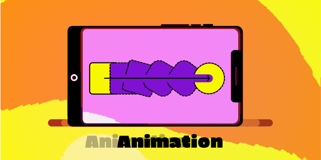
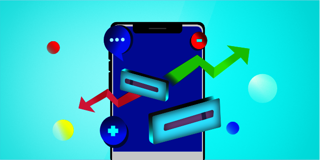
This app design trend is evident to most of you. People love to watch animations, so it's not surprising that this area is developing dynamically.
In today's busy world, people do not have time to, for example, read instructions, and they prefer to watch an instructional movie. It is easier to assimilate information when you have a practical example in front of you. Unlike static content with long descriptions, animation captures users' attention and makes the mobile app more attractive.
Animation, of course, is not only about creating short movies but also about animating small elements in an application, such as buttons. And all this to meet the expectations of users. Micromovements such as the animation of icons can significantly increase user engagement. You can use animations to highlight specific app features and improve conversion rates and sales.
Of course, the simplest forms of animation don't work anymore. Still, at the same time, the intuitive app usage and loading time cannot be forgotten. Even the most excellent mobile application will not stop the user if the application is too slow to load or freezes. The design concept is what counts, as well as an unconventional approach to the subject.
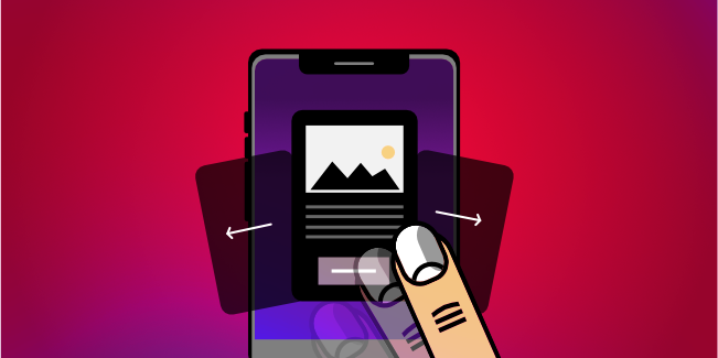
Mobile devices are more appealing than desktop computers because of the gestures and swipes experience. Every day, app users spend hours scrolling and swiping. And they don't need distracting buttons.
This design trend has become one of the top priorities in modern mobile app design. Some app developers don't recommend button design at all. They think the buttons create a mess and take up too much space on the screen. Many popular apps have abandoned the standard buttons in favor of the swiping function.
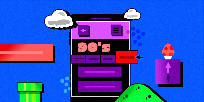
Recently, the style of the 90s has been experiencing its renaissance. This trend did not bypass app creators. It is worth noting, however, that this design style does not suit every product. The atmosphere of the 90s will be appreciated by two types of users: young people who love vintage things and older ones who feel nostalgic for those times.
Therefore, in applications stylized for those times (in which mobile devices were rare), app developers use various design elements, such as retro fonts and graphics stylistically referring to the then-popular PlayStation games (e.g., Mario).
Until a few years ago, simple graphics without depth were quite common. Today, mobile app users prefer realistic and interactive content. Shadows and layers add depth to graphics, and users get incredibly realistic images.
You can use this trend with any element to create a tiered system of objects on the screen, making it more straightforward for users to get around the application.
In addition, many apps use 3D technology that can be used in almost all mobile apps.
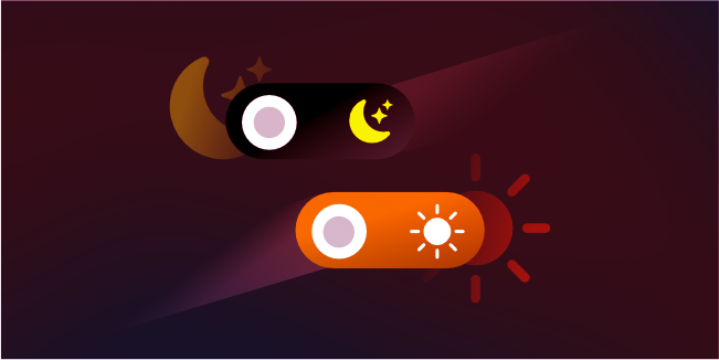
Dark Mode is one of the biggest design trends in many web and mobile products.
In many applications, the function of changing the display mode of the application from dark to light and vice versa has been introduced. On the one hand, it allowed satisfying two groups of users simultaneously: those who like the dark mode and those who prefer the light one. Users can choose which mode they like better. On the other hand, the dark mode is better for visual fatigue, so we have a useful and healthy aspect here.
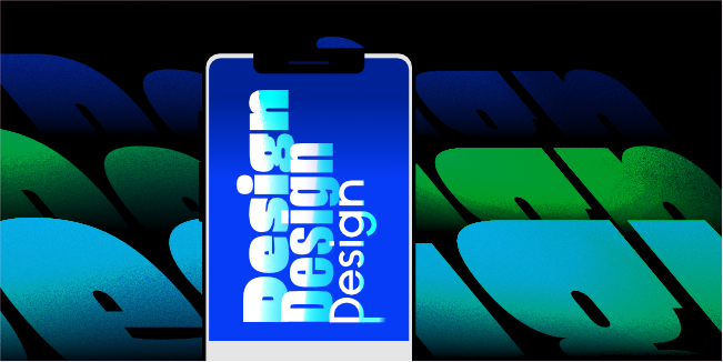
Typography is an area that has been underestimated for a very long time. Fortunately, that has changed, and all the issues related to the type of fonts used in the app are now at the top.
Today, every app developer realizes that choosing the right font is important in designing mobile and web applications. It is because of the enormous amount of information that is reaching users everyday people have stopped reading it and instead "scan" the content with their eyes. Therefore, the choice of font allows, among other things, to emphasize important content that, in our opinion, should reach users. In addition, a well-chosen font gives style to the entire application, increases brand awareness, and provides a better user experience. The "trifles" are also important, which, contrary to appearances, have a huge impact on the page's readability or application, such as line spacing, line length and alignment, and font thickness.
There are many ready-made fonts; you can also design your own typography. However, it must not be forgotten that the font must match the application. The too-crazy and avant-garde font in a medical app will surely alienate users. On the other hand, the stencil font in meditation apps may be considered boring.
Therefore, before you choose a font, think about the function of the text in your application. Then the selection of the appropriate typography will be easier and more suited to the nature of the application.
-
Virtual Reality and Augmented Reality
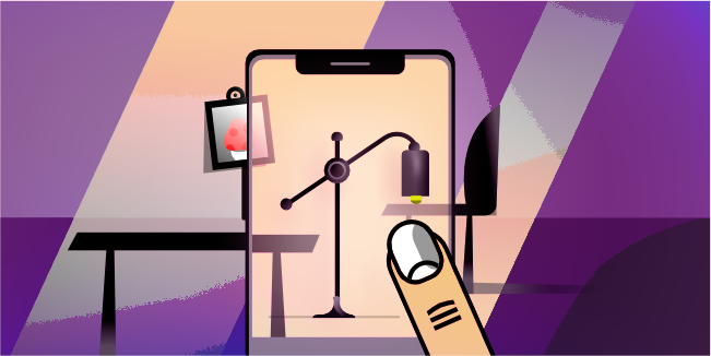
Virtual Reality (VR) and Augmented Reality (AR) create fantastic opportunities for interactive user experiences. This trend became immensely popular during the Covid-19 pandemic when millions of people spent all their time indoors.
The secret to this design style is that the application's user interface makes you feel like you are inside the program. The keys to this experience are attractive design features and gamification.
Virtual and augmented reality are yet more exciting possibilities to incorporate the existing trends we covered earlier, such as animation and 3D effects. These components might help VR in application development.
-
Gradients and Transparent Elements
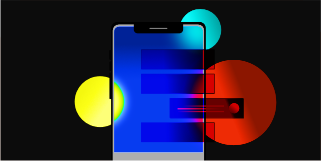
On button and application backgrounds, designers frequently utilize gradients. The mobile gradient trend emphasizes critical features of the program and creates a sense of hierarchy by emphasizing particular aspects.
Additionally, the clear elements within the mobile app's design give it depth and make definite parts of the application more noticeable - making the design more appealing. This solution is famous not only in mobile applications but also more and more often in web design.
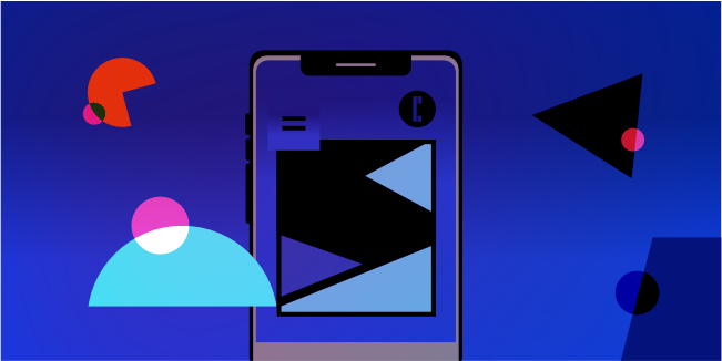
People are mainly drawn to abstract paintings and geometric art because they look artistic in apps. App developers use colors and shapes to stand out without removing the application's functionality or looking like a copycat. This method is straightforward and usually successful in getting someone's attention. Also, choosing expensive photographs or illustrations is not necessary.
Therefore, consider whether this trend will satisfy your users when creating a mobile app.
Good App Design Practices
Each of the above trends is interesting and highly inspiring. However, it is worth remembering that implementing all possible solutions does not mean creating an ideal application. Because an ideal application meets users' requirements and is intuitive to use and valuable, each application should be tailored to the users, not the other way around.
At the same time, it is worth paying attention to several aspects of app design that will make designing high-quality.
A mobile application must be simple and transparent. Therefore, get rid of anything that is not necessary. Applications overloaded with content/graphics/extras quickly become boring, and using them ceases to be a pleasure.
The application must be intuitive. Users do not have the time or the inclination to read the operating instructions. Either they know how something works immediately or uninstall the application.
A common mistake, especially among young creators, is designing menu bars with too many options. Meanwhile, the buttons distract and take up space on the screen, and most importantly - too many buttons irritate users.
Personalizing the application makes it more attractive to users and stands out positively against the competition. Therefore, make every effort to ensure that the user feels that the application was created especially for him.
The app needs to run fast. If it's too slow or freezes, you will surely lose users. Too slow loading time is the main reason for uninstalling the app.
All data collected by the application must be secure. It is essential to be clear about how users' data will be shared in the mobile app and to give them control over this.
Where to Find Inspiration?
Well, you can look for inspiration for mobile app design ideas... everywhere. It may sound strange, but the best designers draw inspiration from everything surrounding them, e.g., nature, music, books, conversations with loved ones, etc.
The Internet is undoubtedly a mine of ideas. There are many sites where both designers and creative agencies publish their work. For more inspiration, check out Awwwards, a repository of hundreds of designs by individuals worldwide, or Mobbin, which has over 60,000 screenshots of the program.
Instead of wandering around without a plan, focus on the websites of companies related to the industry that interests you. If you are going to create a food delivery app, oversee the competition's projects and ask your friends for their evaluation. Browse the random portfolio of food delivery application development company. At the same time, focus on ensuring that inspiration does not turn into copying. Apart from the legal aspects, it is worth remembering that mobile application users expect originality and freshness; they will certainly not appreciate an application that will be a copy of another mobile application.
Conclusion
Creating an app that looks current and beautiful is difficult because trends never remain the same, and there's always something new to discover. However, following design trends is a must for any mobile software developer.
As the best product development company, we have been creating successful digital products for many years. We run projects from beginning to end, but we are also open to the role of the switch company when customers dissatisfied with the services of the previous partner ask us to complete the project. No matter your situation, do not hesitate to arrange a free consultation with our specialists. We love talking to people and sharing our knowledge and experience.