Mobile Development
UX/UI & Design
Mobile App Design - Guide (2022)

Creating a mobile app is a complex project. Combining them will make it complete, readable, and appealing to users who would want to download and even pay for it.
One of the most critical aspects of developing a mobile app is designing what it looks like and how to use it. It is the visual aspects that attract potential users.
Appealing graphics and a cleverly solved user interface can often make up for the imperfections of the rest of the application. That is why designers are in great demand and are looking for new ways to improve their work.
Mobile app designers are looking for the ideal instrument to improve their product's usability. Developing a useful mobile application necessitates exceptional talent, innovation, and, most importantly, appropriate technology.
With over 12 years of experience creating successful apps, we've written this article as both a beginner's guide and a reminder for the more advanced. First, let's start with the basics.
What is Mobile App Design?
The appearance and feel of a mobile application's UI are referred to as its design. It encompasses all the visual and interactive elements influencing how the app works.
Mobile app design combines two concepts. UI and UX.
The User Interface (UI) is the graphical layout of an application. It consists of the buttons users click on, the text they read, the images, sliders, text entry fields, and all the other items the user interacts with. UI design includes screen layout, transitions, interface animations, and micro-interactions.
The User Experience (UX) is determined by how they interact with it. In other words, it is determined by how easy or difficult it is to interact with the UI designers' UI elements.
In large part, both UI and UX sound the same, so to find out in detail what they differ, we invite you to read our article, thanks to which you will find out exactly what they are, how they differ, and how important they both UI and UX are.
Design is perhaps the most important layer of you application. If you would like to entrust the task of creating your design to professionals, head out to our UX/UI design services page!
How UI and UX work together Making an App?

It is a collaborative project, and the two design teams frequently collaborate. In brief, a UX designer determines how the user interface interacts with users, whereas a UI designer is in charge of how it looks.
The UI team is developing the appearance of all these interface elements as the UX team works out the app's flow, how all of the user input navigate through your activities, and how effectively it delivers information to users.
Let's assume that, during the design process, it's decided that additional buttons are needed for a certain screen. It will necessitate changes in how the buttons are organized and their form or size. The UX team would determine the optimum arrangement of the buttons, while the UI teams would change their designs to fit the new structure. After all, assets like visual weight, call-to-action buttons, tab bars, and other mobile app design components will influence mobile usage.
Mobile App Platforms

According to gs.statcounter.com research, over 72% of smartphone users worldwide are people who choose the Android operating system, and only 27% are iPhone users, i.e., Apple's iOS system. However, the United States is one of the most tech-hungry countries in the world, so if that's your target, consider that in the US alone, iOS users are over 56% of all smartphone users in the country.
It means that most app developers need to design for multiple platforms. There are also significant distinctions between the iOS and Android development processes. When it comes to developing apps for various platforms, different mobile devices, operating systems, and mobile forms, there are several factors to consider.
App Design for iOS
As a mobile app designer who decided to make an app for iOS, you should consider several crucial things. The first thing to remember is that the platform is highly reliable. It's simple and quick to utilize.
Apple also makes it much simpler to find and repair app design issues. As a result, if you have usability concerns, thanks to user feedback, you should be able to correct them quickly and put out an update.
Apple users expect a sleek design. It should be modern and intuitive. You'll also want to double-check that the app works on all Apple devices. It includes iPad apps, Apple Watches, Macs, and more. But don't worry, that doesn't mean working on the exact three times or more. It is the time when os design guidelines come in handy.
App Design for Android
Unlike Apple, Android isn't a restricted environment. As a result, you'll have considerably more freedom regarding your app's development and design than on iOS apps.
There's also a large Google resource with questions and answers if you're new to app design. According to Google, developing and publishing an Android application is typically less expensive than an iOS app.
Android apps, like iOS apps, must consider a design that works across many devices. It should work with wearables, VR equipment, Android Auto, and other devices. There's a separate app store for various device kinds and platforms to consider while designing an Android application.
Wireframes and Mockups

When you create apps, you should know that it needs to be well-planned, organized, and checked. The beginning of the development process is focused on research and planning; that's why for UI and UX designers, it is critical to make sure their mobile design and whole interface feel human-aimed. One way to test that is wireframes.
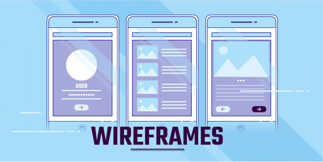
Mobile apps wireframes are a general design of the app layout on a mobile screen. You don't have to be concerned about functionality too much just yet. You're simply getting your feet wet by establishing the basic structure of your perfect app.
Wireframes are visual design that shows how a website or app will appear. In this phase of the design process, there are several excellent wireframe tools to use.
Mockups go one step further than wireframes. These are high-fidelity simulations of what the app will look like when completed. It has the structure and logic of a wireframe, but it combines the UI components and high-fidelity UX/UI features of the design. You can use navigation patterns to understand what the type of your app should look like.
Begin by considering the fundamentals. How many screens will your program have? Start with a sketch of the homepage and work your way down. Remember that your app or web design is a continually evolving project at this stage, so don't worry if something does not fit you. Now is the time to change that.
You may now begin to consider the app layout from this point. What will the data be grouped into? What's the hierarchy of importance?
These first endeavors don't need to be overly complicated. The designers and developers will eventually combine forces to convert your first ideas into code. They'll link your product's pages to ensure the end-users have an easy experience.
They'll also need to double-check the design concepts fit on the screen and make sure they're appropriate. You don't want any part of the design, such as a menu bar or call to action, to be cut off on specific devices.
You'll need to perform some tests before publishing your app or going live with new designs. The app design testing checks that all your concepts work properly inside the program and that the user experience and UI aren't harmed.
While designing wireframes, you as a designer must realize that you should keep up with one relevant task. And that meant you have to think about common user tasks, where the user clicks, whether he uses one or two hands and what buttons are needed the most often. Leave topics like: Should the app send push notifications or use simple in-app notifications? That's not your concern.
Mobile App Design Tools

While paper sketching is still necessary, computer app designing programs make sharing finished or unfinished projects easier with clients, developers, and designers.
Knowing which design tool is ideal for your app is difficult since there are many options nowadays. This article will significantly influence your abilities, whether you're a seasoned pro or a novice.
Adobe Photoshop
Photoshop is a well-known design program. If you haven't used it in a long time, it's gotten a lot better. It's no longer simply software designed to cut and paste photographs.
Photoshop is a useful program for web page design and user experience. Photoshop has a rapport with many designers, at the least. The comfort level of a tool does not guarantee that it would be an appropriate option for the position.
Both artists and mobile app designers may use this program. When you use Photoshop, you can show off your creative side. They offer features like:
- Layering
- Texture
- Lighting
- Blurring
Adobe XD
Adobe XD is a direct competitor of Sketch, and if you're a PC user who has wanted to use Sketch but was restricted because it only works on Mac, this is good news for you. XD is an excellent tool for practicing your mobile app design.
Adobe XD is speedy and simple to use. Even though it is still in its preview stage, it already supports Windows 10 Anniversary Update, which is remarkable. XD appears to be quite promising for designing websites, web apps, and mobile apps.
Adobe XD makes it simple to get started on your first mobile app design project and aids in the quickening of your process once you're underway.
With XD, you can use features like:
- Aligning the Grid
- Layouts
- Interoperability
- Content-Aware Layout
Sketch
Sketch is a web-based UI/UX design tool for app developers that's lightweight and portable. Sketch resembles Adobe Photoshop, but it's designed especially for app prototyping and has one of the highest market shares among wireframing and prototyping tools.
For some, it's the best tool for designing mobile apps. It can save your work, but it will also export assets quickly. You may only purchase it once and renew the license yearly. It's not possible to animate with it. However, for the most part, app designers will find this program ideal.
You can use this program with other programs like Photoshop or Adobe Illustrator if you want to edit photos.
Sketch is well known for its key features:
- Symbols Plug-In for Smart Objects
- Smart Guides
- Easy Grids
- Artboard Presets
- Templates
- Shortcuts
Mobile Apps Design Tips
In the end, your app design choices greatly influence the user experience. As a result, UX/UI design should always be at the top of your mind when going through the design process.
It's important to remember that the user experience is more than just a beautiful interface. Design flaws will impair the user experience, and fewer people will use the app. With all of this in mind, here are some additional suggestions for when you're developing the app for mobile devices:
- Universality - Your app must work on various devices across various operating systems.
- Responsiveness - When users click on buttons, scroll through pages, or move from screen to screen, the app should provide an immediate response
- Call-to-Action - CTAs must be simple to spot. Consider the readability and mobile app UI while designing CTAs.
Summing Up
The design of a mobile app is always changing. There will always be areas for improvement.
Prototypes are the lifeblood of your new concept. You won't have to utilize all of these tools; just the one you believe will help your team go a step further through the design process.
Take a look at other applications on the market to get ideas. Is it possible to learn from their design systems? Consider visual weight, call-to-action buttons, tab bar, and other app design components influencing mobile usage. You may use this data to create your app design guidelines.
Still wondering how to approach the design of your application? Familiarize yourself with our Design Workshop, which goal is to create all aspects from the field of UI and UX design!