Mobile Development
UX/UI & Design
What You Should Know About Mobile App UX

Our world is more and more connected through various mobile devices, so much so that more than half of all online traffic now comes from smartphones! Unsurprisingly, thanks to constantly evolving mobile development, this amount is only expected to increase further.
Simultaneously, we're all too familiar with infuriating mobile app UX designs that are characterized by broken layouts, minuscule buttons, difficult navigation systems, extended loading times, and complex checkout procedures.
In today's landscape, where mobile traffic is ever-growing, user experience and a positive brand impression on your app are crucial for tapping into the full potential of customers. Thus, in order to reach more people with access to your products or best quality services at their fingertips when they want it most - you must ensure that the design of your mobile application meets all expectations!
Let's dive into mobile app UX and discover why it should be a priority for you. Then, we'll uncover what UX Design is all about and present you with UX Desing best practices that guarantee stellar experiences for your users.
Mobile User Experience - What is it?
The mobile UX is the overall assessment of a user's perception when engaging with an app. This encompasses everything from delight to dissatisfaction, making it essential for developers to consider how their product will be perceived before launching.
UX Designers hold the responsibility of constructing a user-friendly product and delivering an experience that is both relevant and meaningful to users. When creating mobile UX design, it's critical to analyze each step of the customer journey. From interactions and content all the way down to sound design.
It's important to recognize the distinction between UX and UI (user interface) since UX design encompasses much more than simply graphical elements of the user interface. When it comes to mobile User Experience, designers focus on adding an emotional component beyond visual aspects. They strive to understand users’ feelings, objectives, and struggles when constructing a layout or product. The key to developing great UX is always the user's expectations and requirements. You can learn more about it in our article about improving UX.
-
Importance of UX Design for Mobile Devices

The principal ambition of mobile UX designers is to create an experience that users can enjoy from start to finish. An excellent mobile UX design should meet the criteria outlined in Peter Morville's user experience honeycomb: functionality, usability, desirability, findability, accessibility, and credibility.
-
Useful - The system has to be designed with the user in mind, catering to their wants and needs.
-
Usable - In order to ensure optimal ease of use, this system needs to be intuitive and self-explanatory.
-
Desirable - To maximize user satisfaction, the system must be designed with alluring aesthetics that stimulate positive emotions and admiration. Your goal is to make users yearn for your software.
-
Findable - The system should be intuitive and easy to use, allowing users to find the necessary information with minimal effort.
-
Accessible - All users, regardless of disability or capability, must have the opportunity to experience your system with full access and usability. This is especially important for those with poor eyesight who may otherwise be denied a positive user journey through your platform.
-
Credible - In order for your product to be successful, users must have faith in you and what you're offering.
-
Valuable - UX must be beneficial for sponsors, whether they are non-profits or for-profit. For organizations with a mission, the user experience should be designed to advance it, while companies aiming to generate revenue need an interface that will boost their profits and increase customer satisfaction.
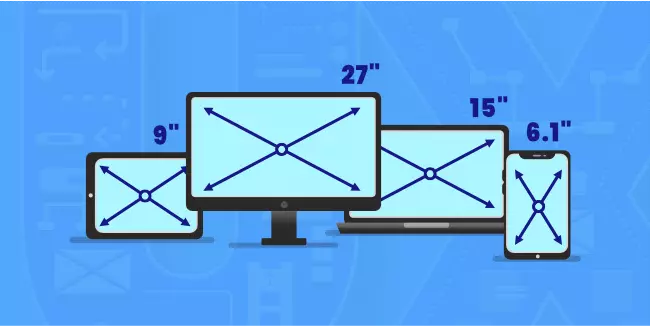
How Does Mobile App UX Differ from Desktop UX? H2
In order to provide your users with the most outstanding experience possible, it is essential that you understand the distinction between desktop and mobile app UX design. After all, simply following a single set of design principles for both platforms will not suffice.
With their large size, computers ensure your pages are always aesthetically pleasing and well-organized, with plenty of room for information.
If you leave your website as is and display it on a mobile device of standard 4-5 ½ inches, the end result would be aesthetically displeasing and confusing to users.
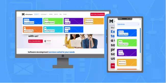
When designing mobile apps, it’s essential to be selective and only include information that is absolutely necessary. Anything deemed not as important can live on a menu or on another page. This will ensure the mobile users' experience is smooth and uncluttered.
If you're working with a desktop, the larger screen size allows for more flexibility in terms of content layout. Multiple columns can be constructed side-by-side to create an impactful display. On the other hand, mobile user experience design must contain all its content within one column. Users will have to scroll down further to absorb everything that is on offer.
Session replay is a powerful instrument that enables you to experience how your mobile app behaves across various device sizes and configurations. By monitoring real user sessions, you can uncover areas for improvement - as well as gain insight into customer engagement with the product. From detecting device-specific problems to comprehending what needs refinement, session replay will give you access to invaluable feedback from users.
Through its evaluation, it can expose a host of difficulties with its execution – from content that is too minuscule to read or buttons situated overly close together on touchscreen gadgets, making them tricky to tap precisely.
When designing a user experience, it’s essential to keep in mind that a majority of users prefer using their mobile phones with just one thumb. As the screen size increases, however, fewer points can be reached comfortably by the thumb; therefore, UX designers should optimize their interface layout and design for easy one-handed use – placing important elements and buttons within a reachable range.
Designers must be mindful of the screen size when creating for mobile devices, as larger screens can make it difficult to easily reach elements and buttons with one-handed use. Thus, designers should strategically place components and buttons based on the size of the screen in order to guarantee that they are accessible using just one thumb.
Designers should be conscious of how they make mobile apps and mobile web pages accessible with only one hand. Specifically, placing important buttons and elements within the thumb's reach, utilizing gesture-based navigation to reduce someone having to stretch for content, ensuring that the layout is uniform across different screen sizes, as well as avoiding making vital features or buttons at either end of a display are all great ways to achieve this.
When designers factor in the different user experiences on various screen sizes, they are able to create mobile interfaces that feel comfortable and intuitive for most users. Additionally, heatmaps can be an incredibly useful tool when it comes to evaluating how people interact with these screens of varying dimensions.
For example, heatmaps can reveal how individuals interact with the interface on small device screens such as smartphones versus larger tablet ones. The data from a heatmap might demonstrate that a button located at the bottom of the screen is commonly interacted with when viewed through its smartphone size but not so much if seen from a tablet's dimensions. This info helps designers make wise changes in their layout and design for varying display sizes to ensure optimal engagement across all platforms.
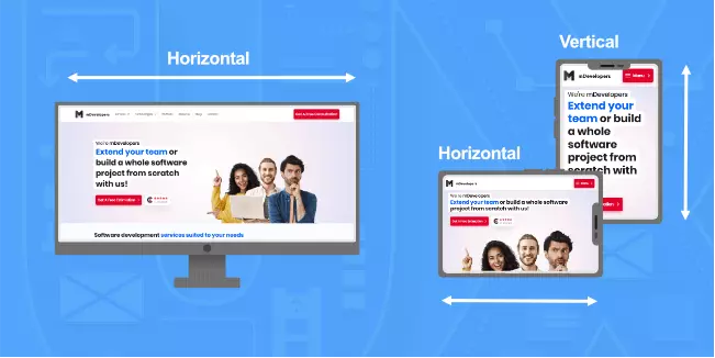
When using a desktop, orientation is strictly horizontal - users cannot modify the alignment. Whereas on mobile devices, there is an option to switch screen positioning; in fact, 94% of people use their phones vertically, while only 6% prefer it horizontally.
Designers should remember this when constructing mobile interfaces. Reading and scrolling are better achieved in portrait mode, while landscape mode is more favorable for watching videos or gaming.
Designers must consider that users could switch between orientations depending on the task at hand. One may switch to landscape mode to watch a movie and then back again to portrait mode while they are reading an article, for example. This should be taken into account when creating any website or application with different modes of orientation available.
To ensure a smooth user experience, designers must design their interfaces with the ability to switch between landscape and portrait modes seamlessly. This means that the layout should accommodate both orientations effectively while also optimizing all of its design elements for those views.
Again, heatmaps can allow you to detect variations in user behavior depending on the device's orientation. For instance, if a button positioned at the bottom of your screen receives little attention when viewed in portrait mode but is more visible when observed in landscape mode - as identified by heatmap analysis - knowing how users interact will assist designers in making optimal choices with regard to layout and mobile app design for both orientations.
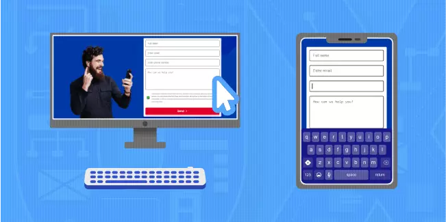
Desktops rely mainly on a keyboard and mouse for user input, although some systems may be equipped with touchscreens. On the other hand, smartphones don't have access to physical keyboards or mice. Instead, they require users to utilize their device's touchscreen in order to type and select elements.
When users need to input data into your website, such as during the sign-in process, offer them various keyboard options so they can type comfortably and more efficiently. This improved user experience is sure to make a positive impact on their overall satisfaction with you!
If the user must enter a phone number or ZIP code, present them with a numeric keyboard for ease and accuracy. Additionally, you should ensure that your action icons are large enough to be tapped without difficulty - too many small buttons close together can lead to missteps and confusion!
Mobile devices have so much more to offer than just button presses - mobile users can now use a range of different gestures for an interactive experience. Scrolling, sliding, pulling down, and tapping (long presses, short taps, or double taps) are the most popular. For instance, 'pulling down' has become one of the go-to options when refreshing pages on mobile screens.
By conducting user research over different behaviors like taps, swipes, and scrolls on your mobile app, you can gain insight into how they navigate - allowing you to recognize areas for improvement.
For example, you may realize that some buttons or links are challenging for users to tap on correctly. Or it could be that certain screens make people irritated and bewildered. By having access to this knowledge, you can adjust the user interface design of your application, which will ultimately enhance the overall experience for your end-users.
Symbols are important for both desktop and mobile applications. As users explore different apps, they become familiar with the meaning of common symbols and icons. To avoid any confusion among your app’s users, it is essential to use typical symbols in their expected manner. If not, you risk people becoming frustrated or losing interest in using your application altogether!
Desktop users can open a multitude of apps and websites simultaneously, allowing them to have more than one application side-by-side. This is especially advantageous when you need your app paired with another tool, like a calculator. Smartphone technology has also evolved to support split screens, though this feature is not as widely used on touchscreen devices compared to the desktop.
Taking into consideration most of your users who have smartphones without the split-screen feature, you should be mindful that they may need to leave your app in order to make full use of it. For example, if they want to compare exchange rates or look up a location on Google Maps and this functionality isn't available within your app - then they must exit in order to check those details.
To avoid users closing your app, whether intentionally or not, provide them with the full functionality they need to use it effectively. Furthermore, don’t direct them out of the application for actions such as registration and logging in; offer everything within the app itself. Doing this on the mobile app user experience will help engender loyalty from customers who won't abandon you for another option that provides a more seamless experience.
Tips For Mobile App UX Design
Striking a balance between simplicity and clarity is key to winning the mobile app user experience race. To help you maximize engagement and boost conversions, here are some of the leading-edge mobile UX best tips:
-
Minimize Content - When developing for mobile, you must condense and optimize your design so that all essential elements remain legible on smaller screens. Crafting a clear and concise layout will ensure an enjoyable user experience across any device.
-
Simplify Navigation - To ensure that your users never get lost in the middle of a task, make sure that you create an interface with user-friendliness and easy navigation at its center. Moreover, always design for one-handed use since not everyone has equal fingertips!
-
Restrict User Inputs - To provide users with the best experience, design your interface in a way that allows for maximum outcomes with minimal tapping of buttons - it'll save them time and frustration.
-
Ensure Continuity - Allow users the freedom to move seamlessly between devices, resuming from where they left off, so their experience is never interrupted.
Summing Up
Crafting a user experience that is tailored to the mobile app environment can be tough. It requires anticipating what users need and ensuring their journey is smooth and free from any obstacles or hindrances. Achieving this goal may appear straightforward, but it's not as easy as it looks – with the right design though, you can ensure successful satisfaction of user needs.
Ready to implement UX improvement tasks for your project? Then why not save time and collaborate with a reliable software partner like us? As the premier product development company, we've been delivering successful projects for years - just take a look at our portfolio! To talk through the details of your project, book a free consultation now with one of our experts, who would be delighted to share their expertise.