website
webdesign
responsive
9 Fascinating Examples of Web Design

To be successful in today's market, you need a prominent online presence. It does not matter if you are starting your business or if it is already established - there are various reasons why you require an appealing and professional own website. A website is a powerful way to build your brand. It's like a digital business card always accessible to the user. You can control how website visitors see your company by using the design elements like the right content, graphics, and messages on your site. However, nowadays, every website has to be responsive. Why? Because the days when people only used the Internet on stationary computers are long gone. More than half of global internet usage is through mobile devices such as phones and tablets. It means that your website must be properly displayed on every possible device.
What is a Responsive Website?

Simply put, a Responsive Web Design (RWD) is a website design that adjusts to the device's screen size. The content on the screen is resized so that it's easy for the user to understand. Responsive websites are adaptable, as seen on a smartphone or tablet.
The key features of a responsive website are:
- Readability
- Adjust the size horizontally
- Ease of navigation
Readability
It is the most important aspect for users. While tablet displays are comparable to smaller laptops', smartphone screens are tiny, and everything must be legible. As a result, it's critical to reduce the image component as much as feasible to make something seem trendy and modern on a little smartphone display.
Web coding standards allow you to remove certain page elements based on the resolution and device on which the website is displayed. Nothing stops mobile phones from having any of these effects, so there's nothing to prevent them from being legible. It's also worth noting that using the proper font size ensures that you can easily read the text without enlarging it.
Adjust the size horizontally
A responsive page is one where the full width of the screen is used, and you don't have to move it sideways to see all the content. The side scroll (right-left) results from a wrong code, website loading error, or simply an unresponsive website.
Ease of navigation
It is a feature that designers often forget. And yet there is no mouse cursor on mobile phones, and you can surf the side with your finger. It means that individual elements in the mobile view should be separated from each other so that the user can easily select one button he is interested in.
Our top 9 Examples of Web Design
A responsive website adjusts dynamically to fit any screen size, providing users with a cohesive and flexible experience no matter their mobile devices (laptop, tablet, mobile phone, etc.). Below are some great examples of responsive websites that are also user-oriented (which is not always the case).

Shopify is an e-commerce platform allowing anyone to create an online store quickly. Shopify provides a consistent user experience (UX) across all devices by customizing its CTAs and images for users viewing from desktops and mobile devices.
The main call to action button is usually on the right side of the form field for those using personal computers or tablets. However, for mobile site visitors with smaller displays, it is underneath to provide a clear display and an intuitive experience as they scroll down with their touchscreen device.
It has also delivered a page load speed of less than five seconds, which is remarkable.
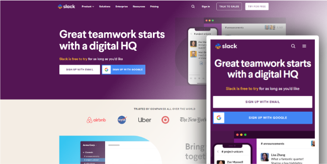
Shopify is a workplace messaging platform known primarily for its simplicity and intuitive use. It is another example of a website with a well-made, responsive web design.
The Slack grid layout quickly adapts to different device sizes. For example, on desktops and laptops, customer logos are presented in a three-column layout and on portable devices in a single-column layout.
Slack personalizes the CTAs depending on where the user is accessing the site. This personalized environment encourages users to take action.

Wired is an American magazine written for those who are enthusiasts of new technologies. Wired's website has a dynamic layout featuring several columns and a sidebar, which can be found on desktop devices. However, suppose you're using a mobile device. In that case, the layout will change to only one column to make it easier for users to navigate the website.
Images are also adapted to your device's screen, with a 16: 9 aspect ratio on mobile devices.
The search functionality and filter functions have been combined into a single drop-down button for ease on mobile devices. Additionally, the navigation menu has been simplified; now, only their logo, menu icon, and subscription link are visible.
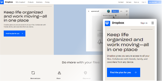
Dropbox is used for sharing and storing all possible files in one place.
Dropbox's new website is a prime example of using a fluid grid and adaptable visuals effectively to create a unique responsive website. The font color changes to match the background color as you transition from desktop computers to mobile phones, not only the image orientation.
Dropbox's interface is context-sensitive, meaning that the experience is customized for every device. For example, to prevent user bouncing (a common issue on websites), a small arrow directs computer users to scroll down to see more content. The same arrow is not present on mobile devices as it is assumed that users will scroll naturally through content—touchscreen interaction being second nature at this point.
Dropbox is another example of great responsive design.
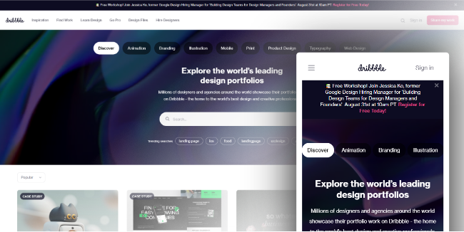
Dribbble is a website where designers and agencies present their portfolio.
A characteristic feature of the responsive design in the case of this website is the use of a flexible grid that adjusts the view depending on the type of device (five-column on stationary devices and laptops, and two-column on tablets and mobile phones).
Dribbble removed some elements in the mobile version to keep the site clean.
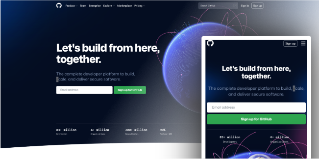
Github is a development platform for building, scaling, and delivering secure software.
This website offers a consistent environment on every device. The differences are slight, for example, transitioning from a two-column layout on desktop computers to a one-column layout on tablets.
GitHub also removed the search bar and covered the menu with the hamburger symbol on mobile devices, much like Dribbble. This standard technique reduces clutter on mobile phones where space is limited.
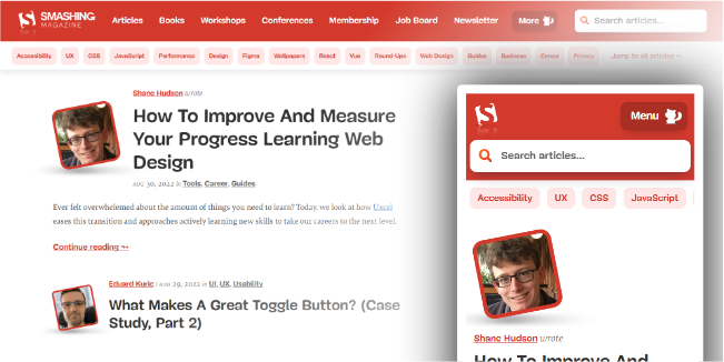
Smashing Magazine is a portal that provides practical articles for web designers and developers.
The Smashing Magazine website proves that with web designs, you can personalize your user experience on every device imaginable. Converting the layout into a single-column one, adjusting the size of graphics, or hiding unnecessary icons are just a few examples of the responsiveness of this page. In addition, Smashing Magazine only loads in 2 seconds, which makes the bounce rate very low and user satisfaction very high.

The Treehouse platform is designed to be simple and easy to use. On all platforms, their menus are getting smaller - desktops and laptops have a four-item menu, tablets have a two-item menu with a hamburger icon, and mobile phones have a single-item menu with an icon.
The same solution was used for the forms on desktops and laptops, which are presented in two columns. On tablets and mobile phones, only one column is necessary.
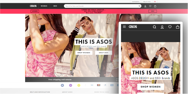
Asos website proves that even a minimalist design can appeal to users. Of course, it is a responsive website that is brightly displayed on all possible devices.
The designers of Asos websites have focused on reducing distractions as much as possible, and all the information key for users is in one place. They used this solution for all devices, thanks to which the page on desktop computers does not differ significantly from the page displayed on smartphones. The highly intuitive website navigation is also essential here.
Conclusion
User-oriented website design builds brand awareness and a positive relationship with users. When creating any online product, do not forget about its users. However, nowadays, every website has to be responsive. Many people think it's a small detail, but it is this detail that determines whether or not you will lose a user. Even the most loyal users will not return to the website when using a desktop computer if they could not use your website comfortably on a smartphone before. If you need help with this, don't hesitate to contact our company. We have been creating user-oriented products for over 12 years, so we would be happy to discuss your idea.